


The Rise of Intentional Noise in Modern Visual Design
Digital design has spent years pursuing the same promise: smoother interfaces, cleaner grids, quieter palettes, and frictionless interactions. That discipline has produced valuable improvements in usability, but it has also created a visual sameness that is difficult to ignore. Across brand platforms, product launches, editorial sites, and social campaigns, polished vector forms and carefully softened gradients often communicate competence while revealing very little character.
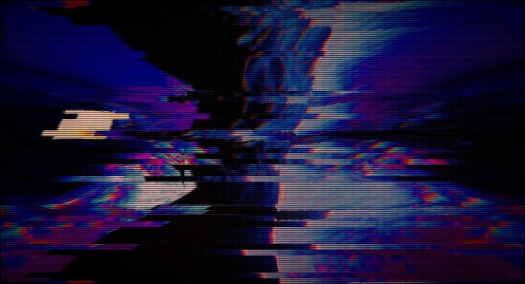
Intentional digital noise offers a different route. A broken image, unstable colour channel, jagged compression edge, or interrupted animation can restore a sense of material presence to an otherwise weightless medium. The effect is not valuable simply because it looks irregular. It matters when the artefact exposes something about technology, memory, transmission, speed, surveillance, or the instability of contemporary communication. What began as an unwanted software failure can therefore become an editorial decision, provided the designer controls its timing, scale, and meaning.
Challenging the Clean Interface and Corporate Polish
The clean interface is not neutral. It reflects a set of priorities: efficiency, consistency, scalability, and predictable behaviour. Those priorities are essential in many product contexts, yet they can also strip digital media of identity. When every image is optimised, every transition is softened, and every irregularity is removed, the viewer encounters a surface that feels interchangeable rather than authored.
This is why glitch-based work has cultural force beyond its visual novelty. Deliberate disruption interrupts the assumption that technology should remain invisible. The artefact makes the transmission channel visible, reminding the audience that images are encoded, compressed, stored, interpreted, and reconstructed by systems with particular technical and economic histories. A useful introduction to that history is the development of Glitch art, which connects technical malfunction with broader questions about media, perception, and control.
In this context, raw compression artefacts can signal authenticity more effectively than a manufactured imitation of craft. A blocky JPEG edge, a torn video frame, or a misaligned colour channel suggests that an image has passed through a real process. The mark feels contingent rather than decorative. That distinction matters to creative teams trying to escape the highly managed appearance of corporate communication.
- Expose the medium: let encoding, scaling, or transmission become part of the visual message.
- Interrupt expectation: use a controlled break to create emphasis rather than applying distortion uniformly.
- Preserve authorship: make the artefact support a clear concept instead of allowing an effect to become the entire idea.
- Question polish: treat technical perfection as one possible design choice, not an unquestioned measure of quality.
Rosa Menkman”s writing on glitch is especially useful here because it treats visual failure as a way to investigate the compromises hidden inside technical standards. A glitch can reveal the limits of resolution, compatibility, compression, or software interoperability. Once a visual language becomes a preset effect, however, its disruptive power weakens. The strongest work therefore does not merely apply a “glitch” filter. It chooses a specific failure mode and gives that failure a role in the narrative.
Core Techniques Behind the Aesthetic of Software Failure
Different forms of digital distortion produce different kinds of meaning. Databending changes the data of a media file so that an application interprets it in an unexpected way. A designer may open an image as text, alter selected values, or pass the file through a process intended for another format. The resulting image can contain smeared forms, abrupt colour fields, and structures that seem both organic and computational.
Hex editing works at a lower level. A hexadecimal editor exposes the numerical representation of a file, allowing specific bytes to be changed without relying on a visual interface. Small edits may corrupt metadata, alter image information, or cause a decoder to produce unexpected patterns. This method is less immediately accessible, but it provides precision and repeatability. Datamoshing, by contrast, manipulates video compression behaviour, often by disrupting or reusing the relationship between keyframes and predicted frames. Moving objects may stretch, dissolve, or leave trails as motion information is interpreted across an altered sequence.
| Technique | Technical principle | Typical visual result | Best design use |
|---|---|---|---|
| Databending | Media data is altered or interpreted through an unsuitable workflow | Smeared forms, unexpected colour blocks, fractured contours | Expressive still imagery and exploratory visual identity work |
| Hex editing | Selected byte values are changed directly in a file”s structure | Localised corruption, decoder errors, precise structural shifts | Repeatable experiments and conceptually rigorous artefacts |
| Datamoshing | Video frame relationships and motion prediction are disrupted | Trails, melting movement, frozen or displaced subjects | Motion graphics, music visuals, and transition sequences |
| Compression manipulation | Quantisation, resolution, or frequency information is stressed | Blockiness, banding, ringing, and softened detail | Campaign imagery that references transmission or digital memory |
The key difference between amateur experimentation and a dependable studio workflow is control. Early glitch discoveries are often accidental, but production work requires designers to identify which variables produced the result. Preserve the source file, record the application and settings, isolate the altered stage, and create several variations from the same intervention. That process turns a one-off accident into a reusable visual method.
Compression science also offers a useful reminder that artefacts are not random decoration. Banding, for example, can emerge when smooth gradients are represented with limited tonal precision. Research on adaptive debanding describes how reconstruction, local gradient analysis, and carefully selected dithering can reduce such artefacts. For a designer, the practical lesson is that the same technical mechanisms can be used in opposite directions: artefacts can be suppressed for clarity or amplified when their presence carries meaning. What matters most is knowing which information is being damaged and why.
From Algorithmic Modelling to Intentional Human Control
Machine-generated variation can be productive, but automation does not remove the need for editorial judgment. Generative tools, procedural systems, and neural models can produce more options than a team could manually create, yet abundance alone does not create a coherent visual language. The designer still has to decide which outputs are legible, relevant, ethically appropriate, and consistent with the project”s purpose.
This principle appears across computational fields. In an interdisciplinary parallel drawn from molecular pharmacology and bioinformatics, the research paper From Ternary Modeling to Predictive PROTAC Design examines computational targeted protein degradation, demonstrating why robust predictive workflows combine generative algorithmic modelling with strict structural constraints, feasibility checks, scoring, and empirical validation. The parallel for visual design is direct: allow the computational system to explore a wide generative territory, then filter the results through rigorous human editorial criteria. Generative design research likewise emphasises meaningful interaction, user control, and the limitations of opaque model behaviour. Machine chaos is most valuable when it expands the search space without taking over the decision.
A practical editorial rule is to assign distortion a job. It might mark a transition between sections, communicate unstable data, separate archival material from current content, or make a brand feel situated in a particular technological era. If the artefact obscures a headline, removes essential context, or produces avoidable accessibility problems, it is not doing useful work. The visual break should be strong enough to register and restrained enough to leave the message intact.
A Practical Framework for Implementing Controlled Errors
Before altering a visual system, establish the reason for the intervention. A team should be able to explain what the error represents, where it appears, and why a cleaner treatment would be less appropriate. This short argument becomes a valuable filter during production, especially when numerous attractive variations begin to compete for attention.
- Define the concept: connect the chosen artefact to a theme such as transmission, memory, instability, surveillance, or technological obsolescence.
- Select the failure mode: choose databending, byte editing, datamoshing, compression stress, or another process that supports the concept.
- Set boundaries: decide where distortion may occur, how intense it can become, and which information must remain untouched.
- Test at real output sizes: inspect the work on phones, large displays, low-bandwidth connections, and printed applications when relevant.
- Check accessibility: verify text contrast, motion behaviour, captions, focus states, and alternative representations before launch.
- Archive the process: retain untouched assets, source files, software versions, parameter notes, and approved output variants.
Accessibility testing deserves special attention because noise can alter contrast and make text difficult to read. A distorted background may look compelling in a presentation mock-up but become unusable when compressed by a browser or viewed in bright conditions. Keep critical copy on a stable layer, provide sufficient contrast, avoid rapid flashing, and ensure that motion-based artefacts do not interfere with reduced-motion preferences or essential interaction cues.
Technical documentation is equally important. Compression artefacts can vary across export settings, codecs, browsers, and display pipelines. Research into compression and compensation shows that frequency information is not affected uniformly, meaning that a small change in encoding can preserve some features while destroying others. Save a clean master, a deliberately degraded intermediate, and a final delivery version. Record the sequence of transformations so another designer can reproduce or adjust the result rather than treating the effect as an unrepeatable accident.
The most reliable teams also separate exploratory files from production assets. Exploration should be broad and permissive, while final implementation should use approved parameters and predictable fallbacks. This protects the core message and prevents a fashionable artefact from spreading into every part of a system without purpose.
Mastering the Balance Between Chaos and Clarity
Intentional imperfection has lasting value because it restores evidence of process to a medium that often hides process completely. In an era of automated layouts, synthetic imagery, optimised delivery, and frictionless interfaces, a controlled error can make a brand feel more situated, more human, and more aware of its own technical conditions. That does not mean every project needs visible corruption. It means designers should be able to choose imperfection when perfection would communicate the wrong thing.
The strongest approach is selective and documented. Start with a clear message, choose an artefact that reinforces it, protect essential information, test the result in real contexts, and retain a clean path back to the original asset. Treat software failure as a collaborator with distinctive behaviour, not as a decorative shortcut. When machine error is given boundaries and editorial purpose, it stops being a defect to conceal and becomes a precise instrument for making digital design feel present, material, and unmistakably authored.