A beautiful thing about digital art is the complete freedom it offers artists. For photographers, videographers or illustrators in particular, the ability to choose a colour scheme and easily apply it to a creation opens up endless possibilities.
An awareness of colour is useful for art buyers too, since it deepens their appreciation of art and helps them to buy artworks that they know will look good in their home. It”s a knowledge that adds to the enjoyment of art.
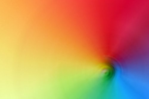
Colour Schemes in Use
Colour schemes add visual interest to a picture or scene, even where there is little otherwise. A classic example of this is the ‘orange and teal‘ colour grading that you’ll often see in movies and TV series. This is typically used to separate skin tones from the background in a way that is easy on the eye and atmospheric. Teal is in the shadows and orange is in the mid-tones.
Colour schemes are used in many ways in art as well as day-to-day life. If you look closely, you can see colour theory applied to all kinds of artwork. It exists in photographic prints or posters and paintings. Interior designers are unfailingly aware of colour principles and use them to inform decorating decisions.
Let’s say you were buying a print or a poster to hang on a wall. How would you recognise colour schemes in pictures, and how can you apply them to your own home? It”s worth looking at some basic colour theory so it can be put to good use.
Principles of Colour
Artists and creators look for colours that ‘go well together’, whether they’re starting with a blank page or searching for existential objects to photograph. These colours and their relationships with each other have names. Here are three common colour schemes:
Complementary Colours
Complementary colours are colours that contrast boldly with each other. These colours sit opposite each other on a colour wheel. Examples in a traditional RYB colour model (used in paintings and often in fashion or interior design) include green and red or orange and blue.
Analogous Colours
Analogous colours are closely related colours that sit adjacent to each other on a colour wheel. An example might include blue, blue-green, and green. They tend to have a more restful effect than complementary colours- the palette is nuanced.
Triadic Colours
Triadic colours are three colours evenly spaced apart on a colour wheel. An example of this in RYB colour is orange, purple and green. Their effect is less low-key than analogous colours and more like complementary colours, except one colour usually dominates while the other two are for accenting.
Making Use of the Knowledge
Knowledge of colour theory is a powerful tool used by many digital artists. But it also gets art lovers thinking about the art they”re admiring and why they”re so drawn to it. Choosing art that will harmonize in a room is an art in itself.